
[PT-BR]
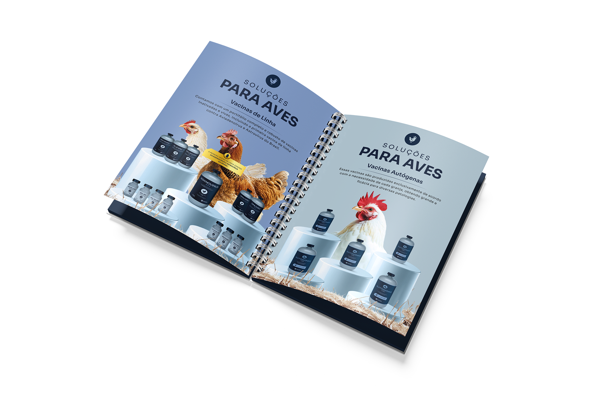
Com mais de 38 anos de expertise, a INATA inicia um novo capítulo da sua trajetória: agora como uma multinacional, reafirma sua força, tradição e compromisso com o futuro. O rebranding nasceu da necessidade de refletir quem são hoje: especialistas em imunizantes desenvolvidos com conhecimento de gerações, aliados à inovação que conecta o presente ao futuro.
Mais do que líder no setor, a INATA é movida por uma essência perseverante e afetiva, que valoriza não apenas a saúde e o bem-estar dos animais, mas também a vida dos produtores. Investir em especialistas é garantir resultados consistentes, segurança e leveza para plantéis em todo o mundo.
Isso não é uma mudança: é evolução. Grandes marcas se reinventam sem perder sua essência. O rebranding da INATA trouxe modernidade, elegância e um novo posicionamento, mantendo viva a identidade que sempre os definiu.
[EN]
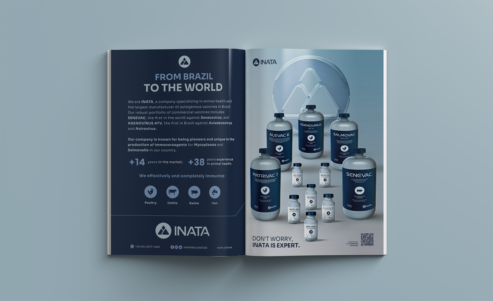
With over 38 years of history, INATA begins a new chapter in its journey: now as a multinational company, it reaffirms its strength, tradition, and commitment to the future. This rebranding was born out of the need to reflect who we are today: specialists in immunizations developed through generations of knowledge, combined with innovation that brings the future closer every day.
More than just a leader in the sector, INATA is driven by a persevering and caring essence that values not only the health and well-being of animals, but also the lives of producers. Investing in specialists means ensuring consistent results, safety, and peace of mind for herds all around the world.
This is not a change: it is evolution. Great brands reinvent themselves without losing their essence. INATA’s rebranding has brought modernity, elegance, and a new positioning, while keeping alive the identity that has always defined them.
Créditos Vídeo:
Roteiro: Mateus Felix
Storyboard: Mateus Felix
Locução: Lorena Carrijo
Edição: Micael Oliveira

[PT-BR]
O ícone anterior apresentava fragilidades que comprometiam a percepção da marca. Era um símbolo sem hierarquia, que não estabelecia um contexto relevante nem agregava valor à identidade visual.
Além disso, o design é problemático: a forma pouco refinada e a falta de alinhamento geram interpretações negativas e transmitem uma sensação de desconforto visual. Esses fatores resultam em perda de credibilidade, especialmente para uma empresa que se posiciona como multinacional.
Uma marca desse porte exige consistência, sofisticação e clareza em seus símbolos, de modo a transmitir confiança e solidez em qualquer mercado em que esteja presente.
[EN]
The previous icon presented weaknesses that compromised the brand’s perception. It was a symbol without hierarchy, lacking a relevant context and failing to add value to the visual identity.
In addition, the design was problematic: the unrefined form and lack of alignment could lead to negative interpretations and conveyed a sense of visual discomfort. These factors resulted in a loss of credibility, especially for a company positioning itself as multinational.
A brand of this scale requires consistency, sophistication, and clarity in its symbols in order to convey trust and solidity in every market where it operates.

[PT-BR]
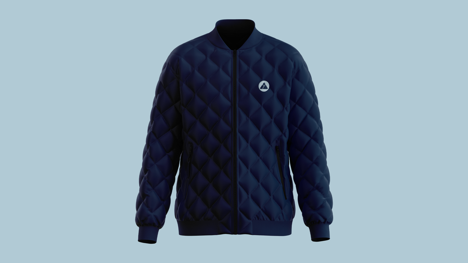
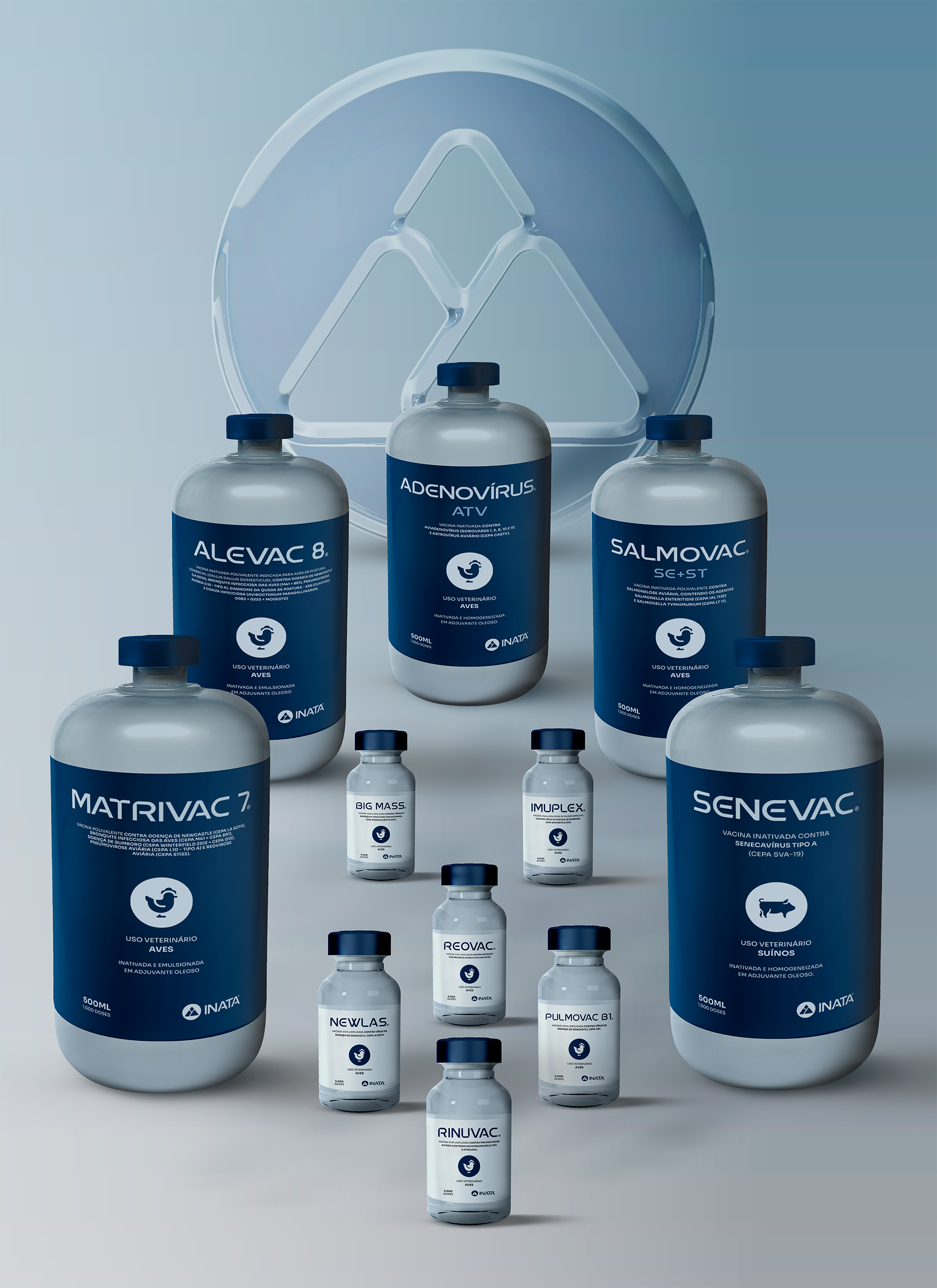
O ícone foi criado a partir de três atributos centrais da essência da marca: grandeza, liderança e história.
As serras mineiras traduzem visualmente essa essência, conectando-se à origem da Inata e ao ponto de partida de sua trajetória. Representam não apenas a história, mas também a grandeza e a inquietude de evoluir que fazem parte da alma da marca.
Esse símbolo carrega um posicionamento sólido: especialista, sério e moderno.
[EN]
The icon was created around three core attributes of the brand’s essence: greatness, leadership, and history.
The Minas Gerais mountains, in Brazil, visually embody this essence, connecting to Inata’s origins and the beginning of its journey. They symbolize not only history, but also the greatness and restless drive to evolve that lie at the heart of the brand.
This symbol conveys a solid positioning: specialist, serious, and modern.

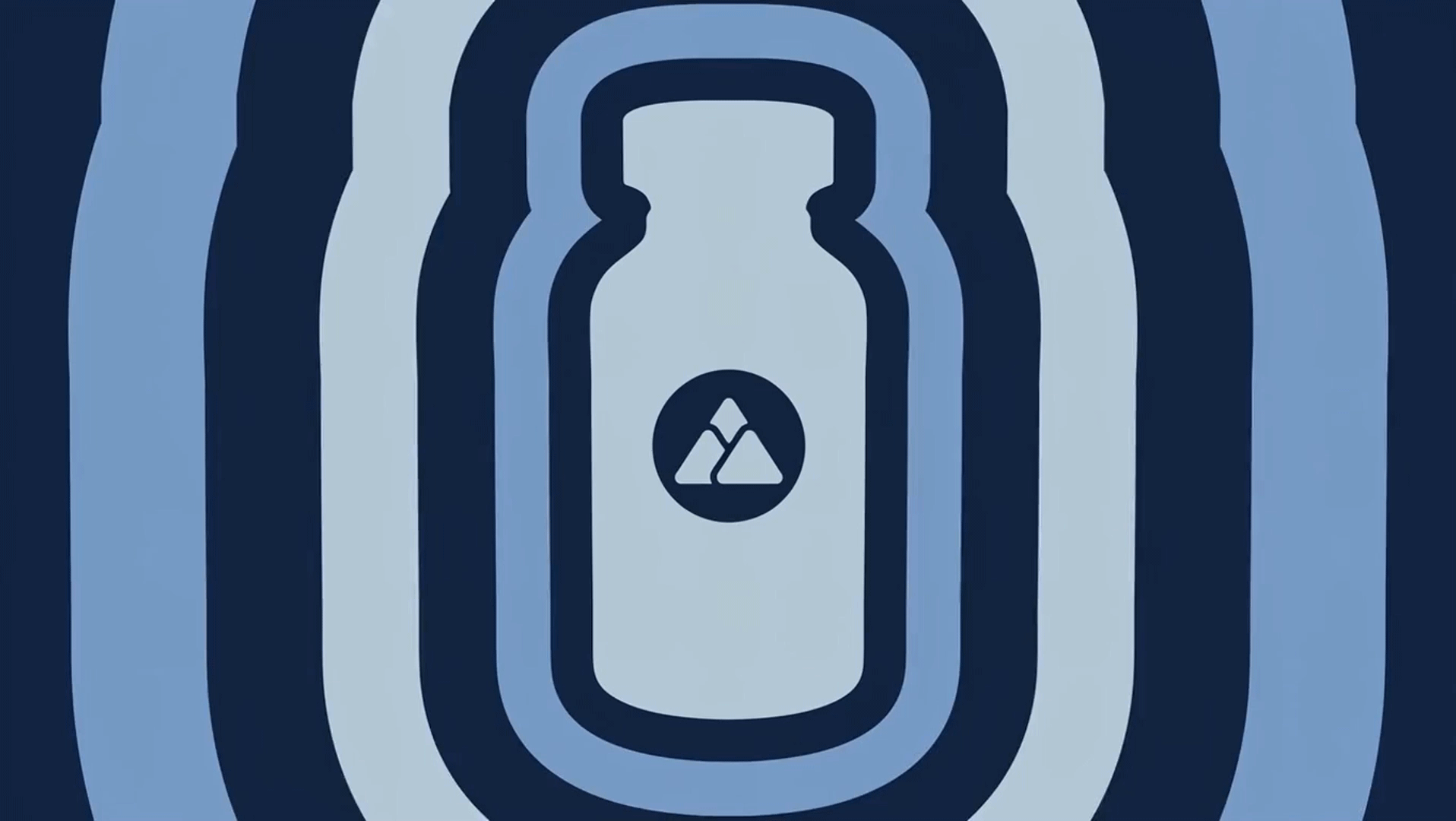
[PT-BR]
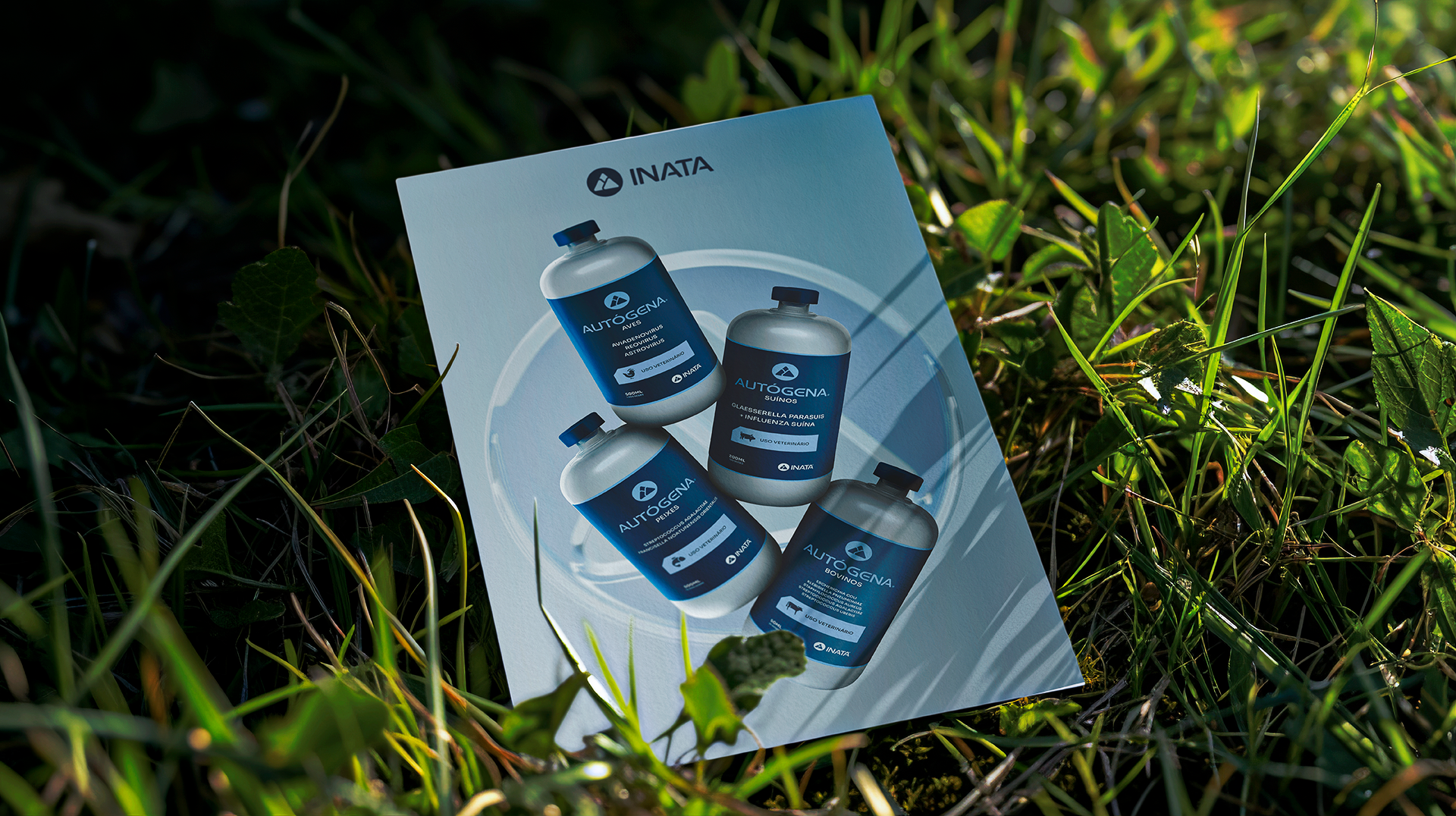
Por que o círculo? O círculo transmite união e plenitude, e para a INATA, simboliza principalmente a imunização. Além disso, ele traz harmonia ao logo, dando ênfase às montanhas. Mas não é só isso.
O círculo também está presente no dia a dia da INATA e no universo laboratorial: lembra placas de Petri, tampas de frascos, tubos de ensaio e rotores de centrífuga, reforçando a conexão da marca com a ciência e a precisão.
[EN]
The circle conveys unity and wholeness, and for INATA, it primarily symbolizes immunization. It also brings harmony to the logo, highlighting the mountains. But that’s not all.
The circle is also present in INATA’s daily work and in the laboratory universe: it evokes Petri dishes, bottle caps, test tubes, and centrifuge rotors, reinforcing the brand’s connection to science and precision.


✦ Olá, como vai? :) Obrigado por conferir este projeto! Deixe seu like se você gostou, e compartilhe o que achou nos comentários.
✦ Hi how are you? :) Thanks for checking out this project! Leave a like if you liked it, and share what you think in the comments.
__________________________________
Vamos criar um projeto juntos? Shall we do some work together?